How to prepare for voice search

Voice search is picking up steam. You can now use your voice to search the web, play music, navigate home, order sushi or get the latest football results. Not a day goes by without news stories about search assistants like Amazon’s Alexa, Apple’s Siri, Microsoft’s Cortana or Google’s – uh – nameless service. You might think that voice assistants are taking over the world, but that’s not the case – not yet, anyway. In this article, I’ll elaborate on the rise of natural language and voice searches, plus give you tips to prepare your content for these new types of visitors.

Optimize your site for search & social media and keep it optimized with Yoast SEO Premium »

Yoast SEO for WordPress pluginBuy now » Info

What is voice search?

With voice search, you use your voice to perform actions on the web. In the past, people often laughed at voice assistants because they were slow and had difficulty understanding and answering questions. However, the current generation of assistants is on its way to becoming incredibly sophisticated. Almost every type of query is possible just by uttering it. We’re not there yet, though, to become a real asset to people’s lives, these devices and services have to take it up another notch. Accuracy is often still an issue.

But why voice? For one thing, it’s fast; people can speak much more rapidly than they can type. It’s convenient, because you can work hands-free and, most of the time, get instant, relevant results, be it in answer to a question or performing an action. In addition to that, the developments on using your voice as an interface, have resulted in a context-based system that uses many components to give you relevant results.

While the significant strides were made on mobile devices, it is now at home were voice operated devices find their place. Amazon has sold millions of Alexa enabled devices, and there’s no end in sight. Recently, Google went on the offensive with Google Home; it’s own smart home assistant.

A look at the data

If you look at data from Mary Meeker’s renowned annual trends report, you’ll see that the use of voice assistants is on the rise. In 2015, 65% of US smartphone owners used a voice assistant, up from 56% in 2014 and 30% in 2013. The main reason for this growth is the improvement of the technology. Meeker also suggests that Google voice queries were up 35 times since 2008 and seven times since 2010. The last one, in May 2016 one in five searches on Android devices in the US is voice activated.
voice search graph
A recent study by Stone Temple Consulting showed that, while people were generally happy with the performance of voice assistants, they’d like them to answer more questions directly.

Content SEO: learn how to do keyword research, how to structure your site and how to write SEO friendly content »

Content SEO$ 19 - Buy now » Info

Why and how do people use voice search?

It might not come as a surprise that people use voice assistants because they’re convenient, especially when your hands are occupied. They’re a breeze to use, even more so for slow typers. Plus, people love getting fast, relevant results and many just plain enjoy the use of this kind of assistant. However, people rather use these services at home or in the car than on the go and at work. There still seems to be a psychological barrier to belt out search queries in a group of people.

Voice searches answer questions

Voice assistants use so-called conversational search queries to get an answer to an individual question. These kinds of queries are spoken in a full, natural language sentence, and the reply is in a whole sentence as well. This is something you have to keep in mind when working on your content SEO strategy. If you ask [What’s the weather in Amsterdam today?], you might get the answer [‘It’s cloudy today, with a slight chance of rain. The maximum temperature is 16C.’] If you’re on a screen-based device, this result might be accompanied by a screen showing you the conditions.

Google Hummingbird

Google made answering questions a priority in its Hummingbird update in 2013. This update was meant to change the way Google responds to queries people write or speak. Since Hummingbird, the context of every word in the search query is taken into account. It’s no longer about the words themselves, but what they represent or mean. If you need a reminder of what Hummingbird encompassed, watch Joost explain it all in this video. Hummingbird had a significant impact on how Google scanned your content. It became incredibly important to structure your text properly.

The 5 Ws

Conversational searches tend to answer the classic 5 Ws: who, what, when, where, why and how. Here are a couple of examples:

  • Who designed the Golden Gate Bridge?
  • What do I need for a BBQ?
  • When did Sesame Street air for the first time?
  • Where can I get the cheapest pizza in the Bronx?
  • Why do birds suddenly appear?
  •  How did Google start?

You see that these natural language, conversational searches encompass more words than our typed searches. These are no keywords, but rather key phrases. If you want to rank for these kinds of phrases, you have to have an answer for these questions. Long-tail keywords play an important part in this. More on that in a minute.

The technology is getting smarter

In the early days, searching with your voice was clunky and error-prone. Many people just gave up in frustration. However, nowadays, voice operated technology is getting smart, fast. Think about it; you can now adjust the spelling of a search query if a result came up with the wrong keyword [night vs. knight]. Searches now take into account what was asked before, so you can ask additional questions to narrow down the results. So, you can ask a voice assistant to find all films by Kevin Spacey. After that, you can bring that down to just the ones he won an Oscar for. Or ones that co-star Morgan Freeman.

Context plays a big part in the recent developments of voice assistants. More and more, these assistants look at the world around you to give you relevant results or actions to take. If you’re at home, you might get different options than when you’re commuting to work. Or if you have a particular app running, an assistant might use that information to make an educated guess about what you are doing or what you might want to do. This is only the beginning; we will see a lot more developments on this front.

Now what?

So voice search changes how we search, and therefore we should closely examen the way we provide our content. If you want to answer the natural language questions people use to search for something, your content is the first thing that needs to be fixed. You need to ask yourself what questions your content is answering at this moment and find out if that aligns with the questions people ask. Is the answer all-encompassing or is it incomplete, thus not satisfying the needs of the visitor? You should also think about the readability; is it easy to understand, scannable and instantly comprehensible?

Take a long hard look at the conversational queries people use to find what they need. Not only look at your data but also check how your competitors are doing and see how they are trying to answer these questions. Use the autocomplete feature in search engines to see which questions often pop up. Put the answers you find in a spot where search engines can easily filter them out. Don’t make it a long winding answer, but get to the point and serve it straight up.

Learn how to structure your site well with our Site structure training! »

Site structure training$ 99 - Buy now » Info

An example of a question answered

Your content and HTML must join hands to respond to questions in the quickest way possible. Optimize the pieces of content you think are valuable for your visitors, plus the ones you suspect people will search for. To illustrate that, we’ll look at an example from Yoast.com. We are continually working on our content to get it highlighted in Google. That’s no easy task, but keep at it and it will work.

voice search featured snippet

Yoast content answers a question directly in the search engine

The content for the featured snippet was taken from this piece of text

In this case, our article on cloaking affiliate links has been optimized in such a way that it can answer the question: [How to cloak an affiliate link]. Google figures out the question and the answer right from the content. In general, it helps if you use short answers, and present it with bullet points. If you use ten or more steps, Google will add a ‘read more’ link to the answer box, likely getting you a higher CTR. Answering questions in this way, not only gets your content ready for voice search but can also lead to featured snippets in Google, like the one below.

Focus on long-tail keywords

To answer natural language questions correctly, you also need to work on your long-tail keywords. Since these spoken questions contain a lot more words than a typed search command [What is the best restaurant near De Dam in Amsterdam] vs. [Restaurant De Dam Amsterdam], you can use these extra words to rank for. It might make it a bit easier to rank higher for the phrases you want to be found for. You’ll also see that searchers will increasingly use terms like [best] or [nearest] to search for relevant results, so that’s something you need to keep in mind.

Another good way to answer questions people may have is by adding a FAQ to your site or optimizing the one you already have. Collect the questions people ask and write a short, but relevant answer. Search engines can directly use these answers to give searchers a valid reply to their voice search commands.

Optimize your page for mobile use

In addition to offering valuable answers to questions people are asking, your page needs to work flawlessly on mobile devices. Check how it functions on multiple smartphones, tablets, and other gear. Is it perfectly accessible on these devices? Is it attractive, fast and easily readable? It is also a good idea to invest in a proper Schema.org implementation because this gives your pages a lot more context for search engines. For instance, you could add Schema.org markup to your review page, so search engines have a valid source to identify your authority.

Conclusion

It sure looks like voice search is here to stay. This brings great opportunities for some, while others might be worried about search engines and digital assistants answering every possible question directly. Should you be worried? Well, that probably depends on your content. If you have high-value content, like recipes, you might be ok. Voice assistants won’t be able to read that recipe for you, yet. If your site offers basic calculation and conversion services, for instance, to calculate the number of teaspoons that fit in a cup, then it’s going to be harder for you to survive in a voice search world.

Regular, content-driven sites, need to be able to answer the question voice-driven searchers are looking for. To get your site ready for the slew of voice-activated searches, you need to think carefully about your content; does it answer the questions people have?

Keep reading: ‘SEO copywriting: the complete guide’ »

Interview with Maile Ohye (Google)

According to Maile Ohye of Google, “SEO is evolving into what Loren George McKechnie described as ‘search experience optimization’. It’s less about top ranking, and more about optimizing the searcher’s journey. It’s the intersection of content, UX, and as always, staying smart about search engines.” We had the chance to ask Maile a couple of questions, and she was able to give some interesting answers.

Maile is Developer Programs Tech Lead at Google. Since 2005, she has been working on making the search engine better. One of her works include the release of rel=”canonical”, plus rel=”prev” and rel=”next” for paginated content. Lately, she is focusing heavily on mobile.

Optimize your site for search & social media and keep it optimized with Yoast SEO Premium »

Yoast SEO for WordPress pluginBuy now » Info

Is Google’s AMP project really going to change the world? If so, can you give our dear readers some pointers on preparing for the upcoming shake up?

The AMP project can definitely make the web better for a lot of people on mobile phones, especially with sub-optimal reception. Ideally, if we could travel back in time, web browsing on mobile phones would have become popular with a format like AMP HTML already in place — instead we had a lot of code-heavy desktop pages that were designed for a broadband connection then ported to mobile. As for an upcoming shakeup, that’s not on our roadmap! AMP isn’t “Google AMP”, it’s an open source project with hundreds of developers who have contributed.

If you’re asking, how will AMP HTML impact Google Search? We still want relevant results for users — we just know users hate slow page loads and AMP is a pretty surefire way to fix that problem and maintain a fast page longer-term. As for pointers on AMP, Yoast, your plugin and blog posts are great. We also have Codelabs if your readers want more info.

AMP is focusing on delivering super fast mobile pages, but will probably grow into much more than that. How will the technology eventually compare with, for instance, progressive web apps?

AMP is great for content-based webpage experiences with basic interactions — it’s not for super-interactive webpages like GMail or Maps. That’s where it can coexist with progressive web apps (PWAs). If you have a more dynamic website, AMP can be great as the initial landing page — the first experience of a user to your site can be AMP fast. Once the user clicks another link on your site, the AMP page can bring them to a PWA experience. (Here’s a demo of a PWA for CNET).

Isn’t Google confusing the web development world by supporting and building these – and other – new technologies? It’s getting nearly impossible to tell if something will ‘stick’, don’t you think?

I agree the number of options can be daunting and “will it stick?” is on many SEOs’ and marketers’ minds. I think with AMP and PWAs, it’s not about Google nearly as much as it’s about what’s best for your customers. AMP and PWAs were spearheaded by Google efforts, but neither are Google-proprietary technologies and both help your visitors whether direct traffic or from Search.

Google is also pushing voice search, AI and making its search engine smarter by way of machine learning (RankBrain). Is it possible that Google will eventually circumvent sites by giving the answer to nearly all questions itself?

First of all, internally, we talk about Search as an ecosystem that includes websites/site owners, users, and a search engine. In other words, websites and site owners are a requirement in search success! When Google provides an answer, we care about attribution. You’ll notice featured snippets still link to a URL for more information. Additionally, there are many queries where a single answer isn’t the end-game. Sites still play a large role in fulfilling searchers’ needs. Sometimes users want to browse, compare, research, learn, go on a journey. Quick answers will never be enough for a broad range of use cases.

A couple of weeks ago, Gary Illyes created major upheaval on the web after announcing that Google will eventually use two separate indexes, one for mobile and one for desktop. This announcement shows once again that mobile is the driving force in this world. Could you tell our readers how this new ranking method will influence their sites and what they should do to not get lost in the shuffle?

With mobile-first indexing, we’ll still have a single index just like the past (we haven’t built two). We still have several Googlebots to help crawl web and apps and get content: Googlebot for desktop, Googlebot for smartphone, Googlebot for images, etc. The difference is that we want to think of the mobile version of a page (the page retrieved by Googlebot for smartphones) as the primary version of the content. This is because worldwide, more people search on mobile than desktop. Now our index can better reflect what mobile searchers will see.

We’re testing the mobile-first index to make sure that searchers still have a great experience. To “optimize” for a mobile-first index, make sure that what you serve to mobile users is the version of the content you’d want Google to index, not a paired down version, or a version that gets updated later than desktop, or version that redirects to the mobile homepage. In most cases, if your site uses RWD (responsive web design), you’ll be fine.

We’d like to thank Maile for taking the time to answer our questions! Follow Maile on:
Twitter
LinkedIn

Maile will also speak at the upcoming WordCamp US conference, where she will give an update on search and mobile trends.

Read more: ‘Setting up WordPress for AMP: Accelerated Mobile Pages’ »

DIY: Test your mobile site!

More than half of all internet traffic comes from mobile devices (fact). So if you are ignoring your mobile site, you might be missing out on on a big part of your audience. In this post, I’d liked to go over a couple of ways you can check your own mobile sites. After this post, you’ll be able to test your mobile website yourself on key elements and improve your mobile SEO.

Use your phone to test your mobile site

Open your phone’s browser and go to your website. See how it looks. You didn’t see that advice coming, right..? I know of business owners that have never done this. They paid a ton of money to create a mobile site but haven’t looked at it after their designer presented the design. Like Nike said: just do it. See what you are missing. Get a feel for the performance as well.

Things that you need to check on your mobile site:

  1. Top tasks. Make sure visitors can find your main pages in an instant. Ask people people of they can use your site. Start with friends and family.
  2. Address and phone number. People use mobile websites of shops to set their navigation, for instance. If you want customers to find your store, list your address. If you want people to call you, this is the main call-to-action on your mobile site. Make it clickable.
  3. A working menu and a search option. It’s nice to add a hamburger menu as it saves space, but please make sure it folds out. Add a search option as a backup for your menu.
  4. Mobile design and UX. Make sure your mobile site is not just your entire website squeezed in that little screen without proper responsive scaling. Do make sure that your mobile site offers the same content as your desktop site — i.e. mobile parity.
  5. Buttons and links. Make sure these are easy to spot and large enough to click.
  6. Readability. Reading from a screen is hard, make sure that your typography is in order.
  7. Performance. How is the site speed? And the page experience?

Please find more information on this in our mobile UX article.

Note that different phones will differ in how they present your website. For that very reason, we recommend checking the mobile version of website in other ways as well to find flaws in your mobile site.

Google’s Mobile-Friendly Test

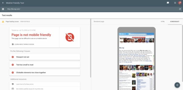
Mobile-friendliness is a ranking factor. Mobile-first is the game. Google created a test tool, which makes it easy to see how Google sees your website. Bing also has a similar mobile-friendly test.

The test results for a site not optimized for mobile

The Google Mobile-Friendly Test shows a rendering of your mobile page. If that page looks like the one on above, my guess is there is still work to do. Even if Google tells you your website is mobile-friendly. Remember that it’s an automated check. Do check all the things in this article manually, just to make sure you’re not missing things. Sometimes common sense is much more valuable than what Google tells you :)

Web developer toolbar

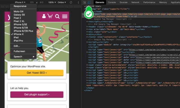
You can also test your mobile site straight from your browser. In your Chrome browser, simply visit your own website and right-click somewhere on the browser screen. Click ‘Inspect’. You can also open it from the menu bar Tools > Developer Tools. After that, click the second icon in the inspector’s menu bar:

Various developer tools inside web browsers come with a helpful responsive design checker

This will open the website like in the screenshot above. It will allow you to see if your website is fit for multiple screens sizes. Firefox has a similar feature called responsive design mode.

When you select for instance any iPhone in that drop down, and it shows your entire website scaled down to fit the screen, you know your mobile site isn’t mobile-friendly.

Performance testing

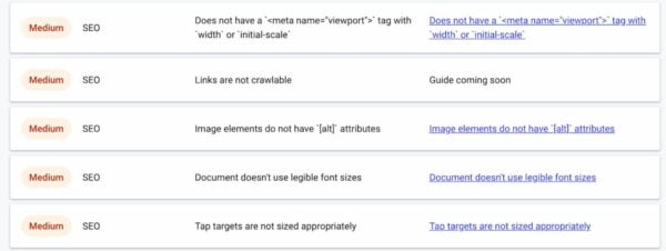
Mobile-friendliness is more than simply checking how your mobile site looks in a browser. Performance plays a big role. So, if you want to make your mobile site a success you need to make performance a priority. Again, there are a lot of tools that can give you insights into the performance of your site. One of those tools is Google’s Web.dev/measure. Simply add your URL and hit Run Audit.

If you score something like this you have your work cut out for you

The tool will show some metrics and ways to enhance those scores. Go through the advice and see what you can do to improve your mobile site. Also keep an eye on tools like PageSpeed Insights that’ll give you a better idea of the site speed aspect of your mobile site.

These SEO enhancements from Web.de/measure all concern the rendering of a page that’s not mobile-friendly

Test your mobile site: conclusion

If you want to check if your mobile site works at all, use the Inspect tool in your browser and Google’s mobile-friendly test. Check for a number of specifics if your website is fit for mobile devices, like top tasks and the size of your buttons. If you would like some more guidance in breaking up your design to fit multiple screens, please read this article on our development blog.

Read more: Mobile SEO: the ultimate guide »

The post DIY: Test your mobile site! appeared first on Yoast.

Setting up WordPress for AMP: Accelerated Mobile Pages

This post explains what AMP is and aims to do, who should implement and why, how to get your WordPress site ready for AMP and how to make sure Yoast SEO integrates nicely with it.

What are Accelerated Mobile Pages/AMP?

The Accelerated Mobile Pages project aims to make pages load instantly on mobile. The web is slow for lots and lots of people, in fact, the majority of the people using the internet do so over a mobile phone, often on a 2G or sometimes 3G connection. To make pages load instantly, AMP restricts what you can do in HTML pages. Fancy design is stripped out in favor of speed. AMP is very much a function over form project.

AMP pages look like a very stripped down version of normal web pages but do contain all the important content. Not all ads will work on AMP, not all analytics will work with AMP. All the “fluff” of your pages is stripped in AMP, including the read more links you might have built into your theme, etc.

The trade-off is that, by sacrificing some of that flexibility (your custom JavaScript, ads, etc.), not only do you speed up your site, but you may become eligible for new, rich results in search engines.

Which plugin(s) to use?

The official AMP plugin does an incredible job of enabling AMP on your site. It can even automatically convert your template and content.

When you enable this plugin, all the post URLs on your site will have a /amp/ version. So you can go to any post, add /amp/ to the end of the URL and you’ll see the AMP version. The plugin adds a standard meta tag in the head of your normal pages that makes it possible for Google and others to recognize these pages exist.

You can also configure the plugin to use ‘native mode’, where it simply replaces your existing theme code and content with amp-compatible version. You may need to make some tweaks in the plugin’s configuration options to get this working correctly on your site, however.

How does this work with Yoast SEO?

We automatically integrate with the official AMP plugin to output correct metadata, structured markup, and other SEO elements. Don’t worry – we take care of everything!

Read more: How site speed influences SEO »

The post Setting up WordPress for AMP: Accelerated Mobile Pages appeared first on Yoast.

Managing a growing blog: technical SEO

As a blog starts growing, you’ll need to do more things to keep the technical aspects of your SEO covered. The first thing you should do, whether your blog is big or small, is installing our Yoast SEO plugin. That pretty much covers everything concerning technical SEO. We made it that simple. But, as your blog or website starts growing, you should also take care of some other technical aspects: 1. security, 2. speed and 3. mobile. In this post, we’ll explain the importance of these three technical aspects for a growing blog.

Growing_blog_2_FI

The very beginning: Install Yoast SEO

WordPress actually is a really SEO-friendly platform, so most technical things are already covered in your WordPress install. For all things not covered, you install the (free) Yoast SEO plugin. Installing the plugin and using the default settings already improves your SEO quite a lot. If you make sure to run all updates of our SEO plugin, all major technical SEO things will already be covered.  

Yoast SEO premium offers some extra features and the help of our support team. If you have a hard time installing our plugin, they’ll help you out. Admittedly, the plugin has quite a lot of different settings and it can be a challenge setting up. We’re currently working on a Yoast SEO plugin training. If you want to know more about what the plugin does and what the different settings are for (and which settings you should use for your specific blog) you should definitely look into the Yoast SEO plugin training (expected spring 2016).

1. Security

As your website gets bigger, you’ll become a more important target for hackers. That’s why you’ll need to make sure your website’s security is really taken care of.

Failing to take the necessary precautions for your WordPress security can lead to malware infections, branding issues, google blacklists and possibly have a huge impact on your site’s SEO 

Read more: ‘WordPress Security’ »

2. Speed

Site speed is one of the factors that determine whether you get a good ranking in Google. Having a faster website will increase your ranking position in Google. A slow website will result in a slow crawling rate that Google uses to index your site. Making your website faster, is a relatively easy way to increase the ranking position in Google.

Moreover, a fast blog will give a much better User Experience than a slow one. That’s another very important reason to make sure your site speed is optimal.

Keep reading: ‘Site speed: tools and suggestions’ »

3. Mobile

In april 2015 Google announced a new update which included the performance of websites on mobile devices as a ranking factor. In the SEO world this update is known as ‘Mobilegeddon’. Consequences of this update are rather simple: if your website isn’t deemed mobile friendly, it won’t rank well in mobile search results. You can’t do without a mobile friendly website anymore!

Read on: ‘Mobile-friendly sites and SEO ’ »

Conclusion

Your WordPress site will be relatively SEO-friendly because you use WordPress. However, so does 25% of the web. Make sure to use Yoast SEO as well and you’ll have most technical aspects of SEO covered. And don’t forget to look into security, speed and mobile!

Sadly, you will not be done with SEO. Ever. You will have to start optimizing your content after you have handled the technical issues.

Read more: ‘10 tips for an awesome and SEO-friendly blogpost’ »


Basic SEO training: Mobile-Friendly Test

Your website needs to be mobile-friendly nowadays. For your users ánd Google. Since Mobilegeddon, it’s just a basic requirement to have a website that works well on mobile. Not sure how mobile-friendly your website is? Google provides a test to check your website: the Mobile-Friendly Test. It runs a check on your website and tells you what you should adjust to improve the user experience on a mobile device.

In our Basic SEO training Michiel shares how this test can help you improve your site for mobile users:


Can’t view this Basic SEO training video?

Check out the transcript below:

Google is actually focusing on this a lot. We’ve already mentioned Mobilegeddon. And Mobilegeddon simply means you have to optimize your website for mobile devices. And Google helps you with that. Google has a Mobile-Friendly Test that will immediately tell you if your website is mobile-friendly or not, according to Google (it’s not fool proof). And it will also tell you what things you can optimize: that could be your font size, it could be an adjustment of viewport (which is actually a bit technical), but it’s also about whether your links are to close together, because that will just make it harder to click one individual link.

If you want to get to know more useful tools that help you optimize your site, check out our Basic SEO training!

Yoast Vlog: Mobilegeddon

On April 22, 2015 “Mobilegeddon” took place. This update to Google’s search algorithm would favor mobile-friendly sites over other sites. So, when searching from a mobile device, sites optimized for mobile would rank higher. Developers and SEOs named it Mobilegeddon, because they thought it would really disrupt the mobile SEO landscape. But did it?

In this video I explain what Mobilegeddon is, why it was created and what the consequences of this update are.

Can’t watch the video?

Read the transcript below!

Today I’d like to talk to you about the Mobilegeddon update. Google didn’t actually call this Mobilegeddon, SEOs around the world did, because they thought this would be the Armageddon of mobile SEO updates. Google just called this The Mobile Update. It was very simple. The reason for this is that Google has more searches coming in from mobile devices than it has from desktop devices. And Google looked bad, when it sent you as a visitor to a site that didn’t work well for mobile when you’re searching from a mobile device. So Google started devaluating sites that didn’t work well on mobile in the mobile search results.

Now, it didn’t seem as though the impact of The Mobile Update was a big as people expected it to be. We were expecting a very very big change and fluctuation in rankings. It wasn’t as big, but over time it has slowly become more important. Google has changed what it requires from your site in terms of being mobile friendly and it’s becoming stricter in it’s mobile tests as well on what you should do to make sure your site performs well on mobile. So if you don’t want to get hit by mobilegeddon now, and in the future, there is only one solution. Make sure that your site works very very well on mobile, for everyone. Good luck!

Keep an eye on our YouTube channel for the latest video updates!

Weekly SEO Recap: app interstitials, snippets & knowledge panel

Joost's weekly SEO recapNext to Google getting a new logo, there was also actual news this week. Like… Google increased the height of its search box. Yes, really. Shocking, right? There’s more:

Do you have app interstitials? Drop them.

If you run a site that has an app interstitial, a popup asking the user to install your iPhone / Android app before leading them to the page they wanted to get to: stop it. The users never liked it, even though it might have worked, but Google has now decided it’s had enough. Google has even been kind enough to give us a cut-off date: November 1. Of course, none of this should come as a surprise, I wrote about it on June 5, when Googlers had already mentioned this would happen.

This app interstitial “penalty” also is just a continuation and an enhancement of what we referred to as “Mobilegeddon” a couple of months ago. I fully expect Google to become stricter and stricter in what it accepts in terms of User eXperience. It’s nice to see them announce changes like this though! Google says it doesn’t apply to cookie warnings and other popups, so no need to worry about those just yet.

Rich snippets don’t change your ranking

Rich snippets (explained here if you don’t know what they are) have become a prime weapon in the SEO’s arsenal over the years to improve the number of clicks you get from the search results. Recently, John Mueller of Google has said that they don’t impact your rankings. That’s not a reason to stop using them, their goal has always been to increase the number of people clicking on your result more than increasing the ranking, but it’s good to know.

Google adds quotes to knowledge panels

If you search for JRR Tolkien, the author of the famous Lord of the Rings novels, you’ll see some of the author’s quotes in the knowledge panel on the right. These quotes are new, showing one more case of Google disrupting an entire set of websites. This is yet another warning: your website has to add serious value if you want to get Google traffic. Value that Google cannot easily replicate. And even when you do add serious value, like Wikipedia, Google might take away some of that traffic.

If you want to learn more about knowledge panels in search results and don’t shy away from reading somewhat more technical posts, this post by Bill Slawski might be a good starting point. Bill analyzes tons of patents by Google (and a few others) on his blog all the time, leading to some very interesting insights in the world of SEO.

That’s it for this week, see you next week!

joost signature

This post first appeared as Weekly SEO Recap: app interstitials, snippets & knowledge panel on Yoast. Whoopity Doo!

Optimizing your mobile content

Optimizing Your Mobile ContentI don’t have to tell you that mobile traffic is taking over desktop traffic in a fast pace. Mainly because I already did. We have been talking about making sure your website is responsive and how Mobilegeddon is hurting websites. In this article, I’d like to talk about the practical side of optimizing your mobile content for devices with smaller screens, like mobile phones and e-readers.

Optimize design for smaller screens

You have to make sure that you are not just loading the desktop website on that small mobile screen. That just won’t fit and will require your readers to pinch and zoom. Make the best use possible of that mobile screen; use a responsive website. This means you’ll have to make sure that on pages that focus on content, the screen is filled with that content and nothing else. No distractions.

Optimizing mobile content

If your site’s mobile design is optimized for mobile devices, so should your mobile content be. Responsive design means you are serving the same website, the same mobile content as the content you are serving in a desktop browser. Does that change the entire ball game? No, it most certainly doesn’t. I actually don’t think you’ll need to change the way you write content. Writing content for online readers has to do with summarizing and preparing your text for scanning. Let’s go over a few common issues.

Headings

Headings have to be short and summarize the section or paragraph they are added to. Try to focus on the main subject, while trimming away all the extras. Especially for mobile content, long headings will appear aggressive. They will take up multiple text lines and push all the valuable paragraph text down. That is of course much less of an issue on your desktop site. Can we add numbers to that in terms of font size and number of lines? No, not really. It all depends on the font you have chosen for your headings, and even the color of the headings. You might want to tone your mobile content headings down a bit, if your desktop site has vibrant colors. That will already help a lot.

Introduction

Try to explain the main subject of the page or article right in the first section of your mobile content. As with desktop sites, scrolling isn’t bad at all on a mobile site. But leave it up to the visitor if he or she wants to scroll, and allow them to make that decision as soon as possible.

In the introduction of this post, I have also added some escapes (links): perhaps this post isn’t the one you were looking for, so feel free to visit some of the other articles we have written on the subject.

Prevent scrolling back

Marieke and I have been talking about reference words quite a bit over the last few weeks. I tend to refer to headings or the previous paragraph using sentences like “This means…” or “That could…” as the first sentence in a new paragraph. For the flow of reading, even more when it concerns mobile content, that isn’t what you want to do.

This means that a visitor isn’t able to scan your article. See what I did here? The first sentence of this paragraph should have been: “Don’t use reference words to refer to a word in another paragraph, as this will mean a visitor isn’t able to scan your article”. The first sentences of all your paragraphs combined, should summarize your article.

If the first sentences of your paragraphs summarize the article, your mobile visitor can easily scan the mobile content on his phone and understand your main point.

Conclusion

The final paragraph or section of your article has to contain a short summary and your main conclusion. That also means this isn’t the conclusion of this article yet, by the way. Your article has to have a head and a tail. You are managing expectations in the introduction (head) and you are sending the visitor home with your main conclusion about the subject at hand (tail).

My posts are usually about something you can do right after reading. I hope to shed some new lights on certain subjects, but most of all I try to motivate you to optimize your website with some common sense and a variety of tools I use myself. That’s usually the first paragraph of my conclusion. Besides that, I always ask for your opinion on things or ask you to go and optimize your website. I use the last paragraph of my conclusion for that.

On a mobile device, chances are you won’t get to that conclusion. A bus might arrive, or someone starts talking to you. You are distracted. That is why optimizing your mobile content, even more than for desktop content, requires you to keep all of the above in mind.

Optimize images

On a mobile phone, images usually take up most time to load. Make sure file sizes are as small as possible. Design for performance. A few years ago, we were all claiming that image size mattered less, as internet connections were getting faster. That still goes for desktop in my opinion, but you might want to reconsider this for mobile content. Matthew Young did an article on optimizing images for your mobile website, highlighting the three main issues:

  1. Use a page speed to tool to identify which images are the culprits.
  2. Compress your images.
  3. Define your image dimensions.

Drop the full article in your Evernote: The #1 Thing You Can Do to Improve Mobile UX: Image Optimization.

There is one extra step one could take to optimize these images: serve another image on your mobile website. You can do this by using the <picture>-tag and a media attribute. Or, if you are not a (front-end) developer, use the RICG Responsive Images plugin (WordPress) for that.

Actual conclusion

In this article, I tried to give you some hands-on advice on how to optimize your content for mobile readers. If you are serious about writing mobile content, there are a couple of things to consider:

  • Use a clean design that focuses on your content.
  • Optimize your text for scrolling, by using headings, adding a proper intro and optimizing the first sentences of every paragraph.
  • Write a great conclusion, but keep in mind some mobile visitors won’t read it.
  • No text without images, so optimize your images for faster loading.

I’d like to send you off with one last advice. In this article, I already mentioned that most tips apply to both desktop and mobile content. If you are serious about optimizing your (mobile) content for your visitor, please read our eBook on Content SEO. It will help you structure the way you think about your (mobile) content. And in the end, that will bring you the biggest wins!

Our Content SEO eBook is now on sale for only $15 (normally $19). So go and read it now!

This post first appeared as Optimizing your mobile content on Yoast. Whoopity Doo!

Weekly SEO Recap: Apple & Mobilegeddon

Joost's weekly SEO recapNews comes in weird bumps sometimes. While last week was filled to the brim with search news, this week it’s incredibly slow. There was a lot of news out of Apple though, and some of it touches on search and online enough that it warrants discussing it here.

Apple news

Ad blocking

In iOS9, Apple will let you block ads. Yes you read that right. You can block ads on your mobile phone. From a user experience point of view that’s a very smart move. Google and other ad providers have their mouth full about caring about the user experience. Their ads though are often the thing slowing down the page load the most. It’s also worrisome because so many news outlets and other publishers rely on ads for their business model.

Apple Search – Spotlight

This article on Medium talks about how Apple is slowly adding more and more features to Spotlight. Spotlight is its search functionality baked into iOS and Mac OS. If you read that you might think “but it’s not web search”. To that I say: well… Not yet. If you read this, you’ll realize it might become a search engine. If it does, Google would finally get the formidable competitor I think it needs for the market to become healthy again.

SEO News

The biggest true SEO news is a Google test, and one that’s not going to have much impact by my estimation at that. I did want to do a small dive into something that has happened in the last months and see if we know a bit more now: Mobilegeddon.

Who truly got hit by Mobilegeddon?

In one of the earliest posts about the impact of Mobilegeddon, Reddit got pointed to as one of the biggest losers. When I check their mobile visibility now, I can see they’ve completely recovered.

NBC Sports is a better example. Their mobile visibility took a dive and hasn’t recovered (note that the left axis doesn’t go to 0 so it’s not quite as dramatic as it looks):

NBC Sports Desktop and Mobile Search Visibility

NBC Sports does just about everything wrong. Let’s say you’re a normal user and want to go to their site on your mobile phone. First, you get an interstitial for their mobile app. You’re on the go so you click that away, you don’t want to install an app while you’re traveling. You just want your sports news! Then… They give you the normal site. Saying it’s not optimized for mobile is an understatement:

nbc sports mobile screenshot

Another site that got hit quite hard is FT.com. It didn’t recover either:

Mobile search visibility FT.com

The following screenshot was taken with my iPhone 6:

FT.com mobile screenshot

It’s horrible. The peculiar thing is: it does have a mobile site. It even gives you a popup for it:

app.ft.com popup

This leaves me with so many questions… First of all: why? Why not just redirect me if you see I’m on a mobile device? Why not tell Google that you have a mobile friendly version too (using rel=alternate)? And lastly: why a separate mobile site? Why not go fully responsive?

Responsive designs are the future for many reasons. It might seem like more work, in the long run, it’s much less work. Maintaining a separate mobile site is going to be much more costly. FT needs a good SEO and it could do much better with just a few relatively simple fixes. If you’re working on your site though, you’d be much better off just making your site responsive and not having to make changes like that, ever.

It’s clear: the time you could get away with nonsense like this is over. So get your site ready for mobile. If you need pointers, consider one of our site reviews, we’ve got a nice discount at the moment on them too! See you next week!

joost signature


This post first appeared as Weekly SEO Recap: Apple & Mobilegeddon on Yoast. Whoopity Doo!