When you want to make some considerable improvements to your website, what’s the best place to start? At Yoast, we feel that research is always one of the most important things to do. It’ll help you find out what needs work, why it needs work, and of course, what you have to do to make things better.
Looking at our website data in Google Analytics, Google Search Console, and other SEO tools, is already part of our weekly activities. But, in order to dive deeper than just having a look at the plain data, we love to do user research. This is the part where you truly get to know your customers and where you’ll discover your blind spots when it comes to your own website. Within this ultimate guide, we’ll show you what types of user research could be valuable for your own website or company.
What kind of user research fits and complements the existing data always depends on the type of project you run. However, we believe that running a so-called ‘top task survey’ should always be the first step when you start doing user research. As you’ll able to use the outcomes of a top task survey within all future projects.
So, what is a top task survey exactly? To get to know why your customers visit your website, you’ll need to talk to your customers. And, how do you get to talk to your customers without actually having conversations with lots of customers? You could set up an online top task survey, which pops up on your visitor’s screen as soon as you like, either immediately after entering the website or after a couple of minutes.
Questions in a top task survey
The popup is set up for one simple reason: to find out the purpose of their visit to your website.
To make sure you’ll get valuable data out of your top task survey, it’s important to ask the right question. We recommend asking one open question: ‘What is the purpose of your visit to this website? Please be as specific as possible.’
With this open question, you give your customers the chance to truly say what they think. Closed questions make this harder, as you’ve already drawn up certain answers and then you risk missing other important thoughts or opinions your may customers have. And we know, analyzing the answers will take a lot more time, but when you do this right you’ll get the most valuable results.
Next to this one open question, it is possible to add one or two closed questions to take a closer look at your respondents. You might want to know the age or you want to know the type of customer it is. This data can be valuable to combine with the outcomes of the open question answers. In the top task surveys of Yoast, the second question is: ‘Do you have the Yoast SEO plugin?’. This is valuable information for us because we can see the difference between what free users are looking for on our website and what Premium users are looking for on our website.
How often should you do a top task survey?
We recommend running your top task survey once a year. If you have a small website, you can choose to run the survey once every two years. The market you work in is always changing and customers always change, so every time you’ll run the survey, you’ll receive new, valuable information to work with and to improve on.
The exit survey
The following two types of research we’ll discuss are more specific. And, which one you should perform at what time depends on the type of project you’re about to run.
For example, you’ve noticed in your Google Analytics data that your most visited page has a very high bounce rate. This means that you need to know why visitors are leaving this fast. Couldn’t they find what they were looking for? Or did they find what they were looking for and are they already satisfied? You can get answers to these questions by running an exit survey on a specific page.
What is an exit survey?
An exit survey pops up when a visitor is about to leave the page. When a visitor moves their mouse cursor towards their browser bar, they are usually about to leave your website. So, this is the right moment to ask your visitor one or more questions.
Questions in an exit survey
So, your visitor is about to leave, what do you want to know before they’re gone? We recommend keeping the survey short and simple: people are already leaving, so if you want them to fill out your survey, it needs to be short.
The question you ask depends on the page and the problem you want to solve. When you have a specific blog post with a high bounce rate, you might want to know if visitors have found the information they were looking for. The simple open question you could ask: ‘What information were you looking for today on our website?’. You could add a second closed question to see if the page fulfills your visitor’s needs: ‘Have you found what you’ve been looking for?’. A simple ‘yes’ or ‘no’ is enough to get this overview.
The third type of research is ‘user testing’. User testing is the type of research in which you get ‘live’ feedback from your clients because you actually see people using your website or product. At the beginning of this guide, we already mentioned ‘blind spots’ and user testing is the best way to find these blind spots. For example, you know exactly where to find what information or what product on your website, but visitors might not. Seeing testers struggle with finding the right page on your website can be embarrassing, but the good news is, when you know, you can improve!
Why should you do user testing?
User testing can give you very valuable insights during every stage of your process. When you’re creating a new product, it’s valuable to see what potential customers think of it, but it’s just as valuable to see what your customers think of your product that has already existed for over three years. Every test will give you new insights to work with!
User testing also guarantees that the test results are ‘real’. You can see for yourself how your customers use your website or product. The customer can’t ‘lie’ about things. And, that’s a big difference with survey respondents: they can say different things compared to what they really experience.
How to get started
There are three main types of user testing which you could use for your own website or product:
Live, moderated user testing: your testers will test with a moderator in the same room.
Remote, moderated user testing: your testers will test with a moderator while they’re in contact through a video call.
Remote user testing without a moderator: your testers will test without a moderator in their own time and space. They will record the test so you can watch it later.
After picking the method you want to use, it’s important to set up a clear plan with goals and a test scenario. Hereby you make sure the testers will follow the right path and will give you the insights you need. After that, it’s time to recruit your testers. Decide on what types of testers you’ll need to get the best test results. We recommend recruiting different types: young people, older people, experienced people, inexperienced people, etc. Think of all the types of people that might use your website or product now and in the future.
Then it’s time to get started! Create a plan and start testing with your recruited people. Make sure you record all tests, making it easier to analyze the results. As it’s nearly impossible to remember everything that happened during the tests.
Analyzing user research results
There is some difference in analyzing the results of surveys, such as the top task survey and the exit survey compared to the user testing results.
When analyzing an online survey, we recommend to export all data to a sheet and to create categories for all answers. Place every answer into a specific category to get a clear overview of what the biggest problems are. After that, you can easily see what problems need to be prioritized and you can start thinking of improvements. Set up an action plan and start improving!
For the user tests, it can more difficult to create a couple of categories that fit the test results. Here, it’s easier to write a summary for every user test and to combine those at the end. Can you discover similarities? Can you combine some issues to improve more at once? It’s important to look at the bigger picture so you can make improvements that will have a big impact on the future user experience of your website or product!
User research tools
There are several tools in which you can create a top task survey or an exit survey (or other surveys!). We’re currently using Hotjar, but we’re planning to create our own design and implementing it with Google Tag Manager. Tools we know for setting up online surveys are:
Hotjar
SurveyMonkey
Mopinion
On their sites, they have a clear explanation of how to use these tools to perform an exit survey.
For user testing, your needs are different. Testing a website or a product, you’ll need a testing environment for your testers or a test product they are allowed to use. Besides, you’ll need recording material: for testing a website, you can easily record a screen session, but for testing a product, you’ll need to think of a recording set up. Do you have a good camera and a tripod, for example? Then you can get started! When you’re doing user tests more often, you can use an eye tracker as well to get more insights on how people are looking at your website or product, but it’s not necessary!
Are you already doing user research as well? Or have we convinced you to start doing user research? Let us know in the comments below!
Before I started working at Yoast to develop our Yoast Academy training courses, I worked as a high school teacher. After starting my job at Yoast, I quickly realized that the educational principles I came across in my previous job were really powerful tools in the online world as well. In this article, I’ll explore three areas to help you engage your online audience: knowledge gaps, memory overload, and creating a connection. I’ll also give lots of practical tips to help you do better yourself.
The curse of knowledge
One problem that you’re likely to run into when maintaining a site or product is the so-called ‘curse of knowledge’. The curse of knowledge is a cognitive bias that suggests it’s more difficult for experts to explain things to beginners. The Wikipedia entry does a good job of rounding up some key research into the bias. Remember those times you had no idea what the teacher was trying to say and a classmate seemed way better at explaining those things? That’s most likely due to the curse of knowledge. The curse of knowledge is everywhere. And you’re very likely to suffer from it.
The problem: the more you know, the more difficult it is to create something that is clear and intuitive to your users.
Tip #1: Do user research
Before you can solve any problems, you have to identify them first. Get users without any previous knowledge together in a room. Let them use your product or navigate your site. Find pain points and eliminate them. If getting people into a room is difficult for you, surveys can help as well. Ask people what parts of your product they found difficult to use and use that knowledge to improve it.
Tip #2: Add scaffolding
Actively providing extra context and bridging the knowledge gap between you and your users is crucial. ‘Scaffolding‘ is everything a teacher uses to help someone do something that they can’t do on their own. An essential part of scaffolding is thinking about what another person already knows and using that to help them do something new. That’s exactly what you should do as well. Some things you may consider adding:
Clickable question marks that clarify difficult terms;
Internal links to articles that explain a concept you use in a more difficult article;
Images that clarify what you’re trying to say;
Tutorial videos;
Live chat or email support;
Documentation / lessons / articles that your users can use to understand;
Step-by-step plans / flowcharts / instructions
An indication of the level of an article so users can make an informed choice to read or not to read an article.
Always try to make this scaffolding as little invasive as possible. You don’t want to annoy more advanced users.
Tip #3: Audit your materials periodically
Often, it helps to look back on something you made at a later time. When you review something you wrote three months ago, you’ve already lost some of the context and perspective you wrote it with. Which, in this case, is a huge advantage!
When you audit your materials, make sure to consider:
Your intended message: do the materials convey it effectively?
The use of jargon
Assumptions about previous knowledge users have available to them
When humans do things, they use a cognitive system called working memory. This memory saves information in our brains for a few seconds to a few minutes. It allows us to make sense of what we’re doing. Unfortunately, working memory is limited. It’s easily overstimulated. When it is, people get frustrated or distracted. This leads to them clicking away or growing tired of your product. Managing working memory is key to keeping your audience engaged.
Tip #4: Less is more
As creators, we like to get fancy. We want what we make to be cool and fun. Sometimes, this leads to fluff features or content. Carefully consider: does what I’m adding make the whole better? If it doesn’t, remove it. Addition by subtraction is a very powerful tool for engagement.
Tip #5: Pay a lot of attention to readability
One of the most common problems on websites is readability. Most copy is much more difficult to read than it should be. Writing shorter sentences and using fewer difficult words can help your usability tremendously. Even if your audience is smart, easy-to-read copy is very working memory friendly. It simply costs less energy to read. This energy can then be spent on more important things. One way to improve readability is by ruthlessly editing your copy. Ideally, you should spend more time editing your text than writing it.
Tip #6: Break everything down into bite-size chunks
The working memory struggles with large blocks of information. The human mind needs focus, and it’s up to you to create this focus. Don’t write 30-word sentences or 20-sentence paragraphs. Don’t crowd your menu with 20 categories. Don’t stuff 20 options into one tab. It’s overwhelming. Break your materials down into bite-size chunks that are easy to oversee, so your users can focus on what really matters.
Creating a connection
I knew all the theory when I started teaching; that wasn’t the problem. But it wasn’t until I really started connecting with my students that I became a good teacher. One of the most powerful ways to engage your online audience is by creating that fuzzy feeling of comfort, familiarity and connection. And most sites and products don’t do a good enough job of this. Of course, the first requirement is a usable product or site. There are lots of extra things you can do, though, to help reinforce your relationship with your user.
Tip #7: Invest in design and branding
It’s tough to overstate the power of consistent design and branding. Our Yoast avatars are a great example. All over the WordPress community, our avatars are immediately recognized as they stand out from the crowd in e.g. lists of speakers at conferences. The same goes for the images we use in posts and presentations. Providing your users with a similarly positive experience over all the different places where they interact with you, helps you get recognized and valued.
Tip #8: Use the power of storytelling
Stories can be an incredibly powerful medium to make a connection with your audience. Most people remember one or more teachers who were always able to get them on the edge of their seat with great stories which helped them remember what the teacher was trying to explain. Stories and narrative are how people connect and communicate with each other. And storytelling isn’t necessarily about writing a large piece of fiction. You can just as easily hide little nuggets of storytelling in your blog posts or product pages. Yoast CEO Marieke has written a great series on storytelling that you should definitely check out.
Conclusion on engaging your online audience
The tips listed are a collection of insights I gained through my experience as a teacher, product owner and online writer. There are lots and lots more things you can do to make sure your online audience stays engaged. But honestly, if you get all of this right, you’re probably a fair number of steps ahead on almost everyone. Good luck!
Watching your (potential) clients use your website or use your products can give you plenty of new insights. Seeing how they navigate, search or click your site can give you information you wouldn’t get out of just analyzing your data. And, as you know your product inside out, you might have developed some blind spots. Are you ready to discover your blind spots? Start user testing!
Getting to know your audience is essential if you want to be successful in marketing and SEO. That’s why we regularly write about methods to learn more about your customers, users or readers. This is the fourth post in our user research series, you might want to check out our posts about top task surveys, exit surveys, and panel research too!
What is user testing?
User testing is a type of user research in which respondents don’t just give you answers to your questions. Your respondents will actually work with your website or products. This way, you can see what works well and what doesn’t.
When you get people to actually use your website, you’ll probably get some new insights you would’ve never thought of without the user testing because of your own blind spots. Imagine you have an online shop and you sell clothing. You saw in the analytics that the percentage of visitors adding a product to the cart is quite low, but you have no idea why. When you choose test persons who don’t know your website, you can see how your site is used. Maybe a test user can’t find the ‘add-to-cart’-button or there might be a lack of product information, which prevents users from adding the products to the cart, you’ll see them searching for more information which simply isn’t there. Then you’ll already know, there is some work to do!
Besides website testing, you can, of course, make people test your actual products as well. Whether you have physical products or you’re selling software, it doesn’t really matter: there is always a way to make people test your products!
Why and when?
It’s incredibly valuable to get user testing insights next to the data you already get from your analytics. Some outcomes might be very obvious and easy to change, others are more complicated and need some thinking, designing and/or developing.
This is why it’s valuable to add user testing to your process at an early stage. For example, when you’re designing a new website or a product, you could create a staging website to test with. If you have a new product coming out, you could create a prototype to test with. You might understand that it’s much easier to change something to your design when it’s not completely developed and live on the market yet.
However, user testing can be performed in all stages of your process. When you did some user testing a couple of years ago, it might be valuable to do this again. Technologies change a lot and so do users. A new generation might use your website/product differently compared to your users a couple of years ago.
The last reason why you should do user testing next to sending surveys is that you’ll know for sure the results are ‘real’. With surveys, there is always a chance users fill out wrong answers because they overestimate themselves or because they want to fit in a specific answer although they probably don’t. With user testing, there is no chance to cheat!
Types of user testing
There are a couple of user testing tactics you can choose from. We’ll sum them up below:
Live user testing with a moderator
When you perform a live user test, your testers, and a moderator actually come together at a place you choose at forehand. The place can differ, depending on the type of user test you will do. When you’re testing a website or a software-related product, you might choose a quiet office. However, when your tester should test an actual product other places might be more suitable. You might agree that testing a bike, the office isn’t the best spot to choose.
Remote user testing with a moderator
The tester will not be at the same place as the moderator. They are in contact with a video call. The tester will follow your instructions and test your website or product and the moderator can watch along. This way, it’s easy to find testers because they don’t have to travel a long distance to actually meet you. But, with a moderator, you still have the chance to ask additional questions or to correct the tester when it seems necessary.
Remote user testing without a moderator
The testers will receive your instructions and will test in their own time, without someone watching along and helping/correcting them. The advantage is that you can make a lot of people test your website or product in a short period of time, which is good for the representativeness of your research. However, it will take a lot of time to view the recordings of all tests and to set up your report. We recommend using this tactic for small things or small changes to your product to keep it clear and to keep an overview.
Getting started
So, when you’ve decided what you want to test, when you want to start user testing and what tactic you want to make use of it’s time to start.
Create a plan of action
Create a document in which you enumerate the goals of your user tests. Thinking of what you want to achieve at forehand will help you pick the right testers and to set up your test scenario.
Create a user testing script
Create testing scenarios which your testers will have to follow during testing. What questions need to be answered? What path do you want them to follow? What parts shouldn’t be missed? Make sure you get all the insights you’ll need for improvement.
Decide what testers you’ll need
Decide how many testers you want, what tactic you want to use and what type of testers you want. Think of gender, age, level of expertise etc. It can be valuable to recruit a diverse set of testers. Keep in mind that it’s also possible to use different user testing tactics at the same time.
Create the first planning
Decide when the tests need to take place and create a first planning.
Recruit testers
Start recruiting testers. Make use of email, social media, direct contact, use your creativity in here! An incentive can help when not enough people are responding to your call for testers.
Create the final planning
Set up the final planning. When you have recruited enough testers, you can create your final planning for the testing phase and for the reporting phase afterwards.
User testing phase!
Actual user testing. Make sure you record all user tests so you can watch everything back when reporting all findings and outcomes. It’s easy to forget things during all the user tests.
Create the final report
Create the final report with all the results. Report all important findings and report the level of representativeness for your group. A bigger group will be more representative compared to a small group of testers.
Need for additional research?
Decide whether you’ll need to do additional research to increase the representativeness of your research. With the outcomes of the user tests, it might be easy to set up a survey for a bigger group of respondents.
Share results & implement improvements
Share the results within your company or team. Others might have a valuable opinion on how to fix/improve things as well. After that, implement all the improvements you need to make! Some might be obvious and easy to implement, others need to roll in your design/developing process before they can be implemented.
Have you ever done some user testing? Or will you, after reading this post? Let us know in the comments below!
What are the benefits of having a research panel for your business? And what are the differences compared to other types of research? In a nutshell, panel research can give you deeper insights into your audience. But it’s most valuable if you combine it with other types of user research. Here, we’ll tell you what kind of insights you can get from panel research and how to recruit and set up a panel.
Getting to know your audience well is essential if you want to be successful in the search results. So user research should be part of your SEO efforts. This is the third post in our user research series, you might want to check out our posts about top task surveys and exit surveys too!
What is panel research?
Panel research refers to collecting data from a (self-)recruited set of people. In this type of research, you regularly send questions to the same group of people. In doing so, you’ll get to know how these people value your business, products or information. What’s more, you can even get input for new ideas, whether that ‘d be a product, service or platform, for instance.
Because you’re asking questions to the same group of people, you really get to know how they think. And if you do it right, you can get valuable input out of the combination of answers they give.
For example, when the younger participants of your group – let’s say, the people between 15 and 25 years old – all tell you that they appreciate the environmental friendliness of your products, but older people don’t mention this, you’ve already received valuable information. Knowing this, you could focus on being environmentally-friendly in advertisements for younger people. For people above 25, you might want to focus on other aspects of your products.
Then, in the next survey, you could ask how they prefer to receive advertisements. If the younger group tells you they prefer newsletters and the older group tells you they like brochures, you can personalize your advertising even more.
Are the answers representative?
As you can see, you can get valuable information from a panel. However, you need to keep in mind that the answers given by your panel group aren’t always a representation of all your clients or customers. Therefore, it’s good to combine panel surveys with other types of research, such as an exit survey.
For instance, it’s easy to ask open questions to the members of your panel to get detailed data. After that, with an exit survey, it’s easier to ask closed questions based on the panel survey outcomes. Combining all of the data, you can be even more sure about the representativeness of the answers.
Also, when you send monthly or 2-monthly surveys, we’d recommend renewing your panel group about once a year. In doing so, you prevent people from becoming less interested and motivated and you’ll get fresh input from a new group.
Of course, you can also start a new panel for a different topic. You can have several panel groups at the same time. However, panel research is quite intensive, so to start off, it’s better to have one person within your company to focus on one panel and do that right.
Recruiting for a representative panel
So how to start recruiting people for such a panel? Well, you can use several tactics to recruit people. We’ll explain them here:
Participants from other research
When you’re already carrying out other types of research, you could ask if the respondents would like to participate in a panel. For example, at the end of a survey, you could add a question such as ‘Would you like to participate in other research for [your company name]?’ or even more specific: ‘Would you like to sign up for our panel and get the opportunity to give regularly input on new products/services?’ Most people who sign up from here, are already motivated and don’t need an incentive.
Your newsletter subscribers
Of course, you can do the same for your newsletter. More people will read your call for participants, but you’ll probably have a lower response rate. The difference with asking people in other research is that they’re already willing to help you with your research. Newsletter readers might not be internally motivated to help you. So, here, it can be helpful to add an incentive such as a discount code for products on your website.
On your website
On your website, you’ll probably have the same issue as in your newsletter, but since it’s quite easy to add a small pop-up asking people to participate we’d recommend doing so. Make sure they only see the pop-up once to prevent people from getting annoyed by your call for respondents. Here, it’ll also help to provide people with an incentive.
On social media
To reach a lot of people, you could also add a call for respondents on your social media channels. The advantage of social media is that you can reach people who don’t know your company yet. For some surveys or questions, this can be valuable: they can give you very unbiased answers. We’d also recommend offering an incentive here.
Buying a panel group
Another option is buying a group of people for your research. Why would you do this? Sometimes you’re looking for such a specific group of people, it’s hard to find them yourselves. In this case, you can get help from an agency specialized in panel research. They have big databases with people who signed up for participating in a panel.
However, you shouldn’t forget that these people participate in exchange for money or other rewards. Therefore, we think you should always try recruiting members of your panel yourself, but if that doesn’t work, this definitely can be a final option.
How many people do you need?
We recommend setting up a research panel of at least 30 people. Nevertheless, it’s smart to start with a somewhat larger group, because chances are not everybody will fill out all of the surveys you’ll be sending out.
What to do with the results
As we mentioned before, it’s good to combine surveys. Because you have the same group of people answering your questions, you can get deeper insights compared to other research types. For example, you could create client profiles out of the answers. These profiles can be used to improve your advertisements or enhance your services.
Don’t forget to share your results with other departments of your company as well. Sometimes, panels can be an eye-opener when it comes to certain topics. If you involve other departments, research will become an indispensable part of your company in the future. It also works the other way around: other departments can provide great ideas for new survey input. Do they have questions they would like to be answered? Or can they come up with more specific questions about a certain topic for the next survey?
Lastly, we recommend sharing some of your findings or improvements you’ve based on your panel’s input with your panel. If they see the results of their effort and input, they’ll remain more motivated to fill out future surveys.
After reading this, do you think you would start a research panel in the future? Or have you ever done panel research before? Let us know in the comments!
When you’ve welcomed your visitors to your website, you want them to stay and to hang around and, eventually, you want them to convert. Converting could mean subscribing to your newsletter, making an appointment or buying one of your products. Or maybe you have a totally different goal for your website.
But what do you do when visitors leave your website without completing your main goal? How do you find out why they are leaving? Is it a lack of information or is your product too expensive? To find out, you could set up an exit survey and add it to your website. In this blog post, we’ll tell you how.
What is an exit survey?
An exit survey is the type of survey you show visitors when they are about to leave your website. For example, you can make the survey pop up when a visitor moves their mouse cursor upwards and towards their browser toolbar. This is usually the moment that people leave your site.
At that time, you can ask your visitors why they are leaving. It’s very valuable to get information about why people leave your website and why they didn’t complete your website’s goal or a page specific goal.
Are visitors leaving my website quickly?
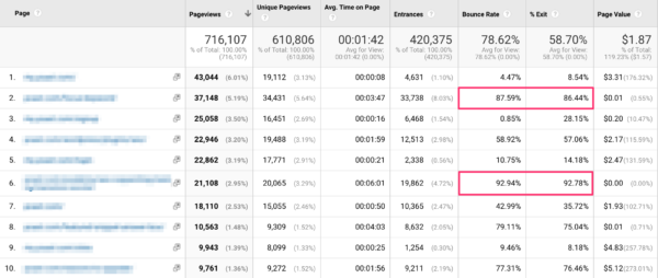
To find out if your website’s content meets the needs of your visitors, the first step is looking into your data. In Google Analytics, you can easily see what pages or posts have the highest bounce rate and what pages or posts have the highest exit rate:
In this example, you could set up an exit survey for the 2 pages with both high bounce rates and high exit rates. However, if you take a closer look at such pages, sometimes the high bounce rates or exit rates can easily be explained. Looking at our own Yoast.com website, quite a few blog posts have high bounce rates and exit rates. This often means that visitors were looking for specific information and found the information in the first blog post and then left. In this case, a high bounce rate or exit rate isn’t always bad. Of course, we work on different aspects of those posts to make visitors click to other pages and posts too, but the priority isn’t that high.
What pages should you start with?
Looking at the data, you could categorize some of your website’s pages or posts. At Yoast.com, we’ve sometimes grouped several blog posts to get more responses in a short time. If you have similar content, you could do this too. For example, when you’re running a shop, you could run an exit survey on all your category pages to find out what visitors think of those pages.
Think of what pages bring the most benefit for your company and start with those. For example, when over 50% of your visitors leaves the cart before finishing the order, you’re missing out on revenue. So, you’ll understand why you should choose the pages that have the highest priority for your website.
Exit survey questions
What questions you ask depends on the type of page. Think of the main goal of your page and what information you want from visitors leaving this page. Here are some examples per type of page:
Cart
What’s preventing you from completing your purchase today?
Do you have any questions before completing your purchase?
Product page
What information is missing or would make your decision to buy easier?
What is your biggest concern about purchasing this product?
After a purchase
Was there anything about our checkout process we could improve?
Which other options did you consider before choosing (product name)?
Informational page/blog post
Were you able to find the information you were looking for today?
How likely are you to recommend us to a friend or colleague and why?
Hopefully, you’ll now have some inspiration to get started!
What to do with all the answers
Maybe you’ve read our blog post about top task surveys as well. In that article, we’ve explained what steps you need to take to analyze all the answers you get from an online survey.
The approach for an exit survey doesn’t differ much from the top task survey analysis. In short:
Categorize the answers
Discover the biggest problems
Set up an action plan
Make improvements to the specific pages -A/B test the improvements when your website is big enough-
Keep an eye on the results!
Tools to start your own exit surveys
There are several tools that allow you to create a survey like this. We’re currently using Hotjar, but we’re planning to create our own design and implement it with Google Tag Manager. Other tools we know for setting up online surveys are:
At Yoast, we continuously want to improve our website and our products. But how do you find out what makes them better? Sure, we need to fulfill the needs of our clients. But how do you know what your client’s top tasks are? Doing research is the answer! We love doing research because we get valuable insights out of it. Here, we’ll dive into one research type we use regularly: customer surveys and in this case, the top task survey.
How do you know what your customers need?
When we started working together with AGConsult on the conversion optimization of Yoast.com, they advised doing a top task survey. Research is always the first step in the conversion optimization process and you simply can’t get all relevant information out of plain data from, for instance, Google Analytics.
To know why your customers are visiting your website, you need your customers to talk to you. If you think, you now have to start a conversation with all your visitors, don’t worry. Luckily, there are several other ways to make your visitors talk to you. An example is setting up an online top task survey, which will pop up on your visitor’s screen as soon as you want it to pop up. For example, immediately after opening your website or after a couple of minutes.
The best question for your top task survey
To make sure you don’t influence your visitor’s answers, it’s important to ask an open question. By asking closed questions, you make your visitors choose between the answers you set up yourself. Although you can add an ‘other’ field, visitors are more likely to quickly choose a listed answer. That’s easier than putting their own opinion in an open field. So closed questions prevent you from getting to know all your visitor’s thoughts.
So, what question should you ask? Within the top task survey we perform on our own website, we always ask this question:
‘What is the purpose of your visit to this website? Please be as specific as possible.’
This pop-up will appear at the bottom right of the website, no matter what the landing page is. The above use of wording encourages visitors to really think about their specific purpose. Also the addition of ‘be as specific as possible’ often results in more valuable answers.
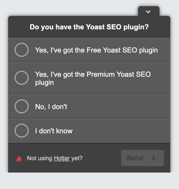
You could choose to only add this one question or you could choose to ask one more question to get more knowledge about your customers. For Yoast, within our top task survey, we always ask visitors a second question to tell us if they already use our most important product:
For other companies, it could be valuable to use this second question to get to know the age of visitors, the market they work in, etc. It all depends on what you want to do with the outcomes. If you’re not going to do anything with the answers on the second question, please use only one question in the survey. The fewer questions, the more visitors will participate.
What to do with all the answers
When you end the survey, you probably have lots of answers to go through. How do you start analyzing all these answers? We recommend to just start reading through the answers and try to set up categories while reading. Set up categories that cover lots of answers, don’t be too specific. You’ll need to find a pattern in your visitor’s answers. Only when you do this, you can create actional steps to optimize your website or your products.
To give an example, we’ve listed some of our own categories below:
Info/buying Yoast SEO plugin
Info specific feature
Info other plugins
Info about courses
Need help
Learn SEO
This might give you an idea when setting up your own categories.
The second step, after you categorize all answers, is setting up a plan. Now that you know which categories are the most important to your visitors, it’s important to optimize your website using that information.
For example, our own top task survey showed us that almost 25% of our visitors are looking for plugin related help. We already had a menu item ‘support’ which linked to our knowledge base, but after the survey, we had the idea of changing the name of the menu item into ‘help’ because lots of visitors named it help.
We set up an A/B test, comparing the menu item ‘support’ with the variant ‘help’ in the test. What do you think happened there? ‘Help’ was a winner! This shows again: knowing what your customers are looking for is the most valuable information you can get.
How often should you repeat this survey?
We believe it’s good to do a top task survey once a year. However, if you don’t change much on your website or in your products, every other year can be enough as well.
Every time you analyze the answers of a new top task survey, you get to know if you’re on the right track or if you need to shift your focus towards another product or another part of your website.
You can never do too much research!
Tools to start an online survey
There are several free and paid tools out there in which you can create a survey like this. We use Hotjar, but we’re planning to create our own design and implementing it with Google Tag Manager. Other tools we know for setting up online surveys are:
We are addicted to our smartphones. For many people, the smartphone is the first thing they check when they get out of bed in the morning and the last thing they look at before they go to sleep. People use them for everything – it’s become huge! Mobile phones have dramatically changed our lives, the way we use the web and, consequently, it has changed SEO. Mobile SEO helps you to reach customers and satisfy their needs while enjoying the experience. This guide to mobile SEO tells you everything you need to know to deliver the perfect mobile experience.
Mobile SEO is all about offering an exceptional experience to visitors of your mobile site. It’s about making your mobile site load quickly and without issues, and presenting stellar content that matches the users search intent. In today’s mobile-first world, it’s incredibly important to have flawless mobile site.
Why is mobile SEO so important?
Mobile SEO is crucial because it helps you reach your your customers in the right place at the right time and and give them the very best experience. Mobile traffic has now eclipsed desktop traffic. Every day, more and more people are discovering the enormous advantages of the smartphone. Our whole lives are in these devices – it’s almost scary to see how attached we’ve become to our smartphones. Many people call it an extension of themselves and something they can’t live without. To reach these people you need a mobile SEO strategy.
Mobile does not necessarily mean on-the-go. Studies have found that people often grab the nearest device to look something up quickly and more often than not, that’s their smartphone. They use it to inform themselves about products before making the decision to buy something, any time, any place. According to research by Google, smartphone users have a higher buyer intent than desktop users. They’re focused and ready to buy. It’s your job to be there when they are looking for your products or services.
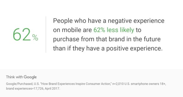
It is easy to see mobile SEO in terms of solving technical problems or content issues, but it is also very much a user experience and branding thing. Getting a bad experience from a brand on a mobile phone might scare away a potential customer forever. Offering a great experience increases the chance of consumers recommending your brand.
According to Google research, negative mobile experiences can really hurt your brand
Mobile SEO vs. desktop SEO
There’s quite a difference between desktop SEO and mobile SEO, but the goals are often comparable. You want to reach your audience and convert them into paying customers. In some ways, desktop SEO tactics also work for mobile SEO, but in a slightly different form. Three major themes still apply: focus on performance, user experience and content. In desktop SEO you’ll often focus more on the general public, while mobile SEO has more of a local focus.
What is different, though, is the results you get on mobile versus desktop. For the same search query, different results may pop up depending on what device you are using. Plus, there are other factors that influence the mobile search results, like the location you’re at. This means that getting a good ranking for your product or content on desktop doesn’t guarantee the same result on mobile. When evaluating your performance on mobile, alway keep an eye on the mobile search results.
In addition, it is always a good idea to regularly check what Google is doing on mobile, in general, but especially in your niche. Google is continuing its push for so-called rich results — often powered by structured data — and these are more prominent on mobile. Think about it: searching for flights, events, jobs, movies, music, products and even simple facts will trigger a Google-owned rich result. We’re going to see a lot more of this going forward.
Google’s mobile-first index is live
The importance of mobile SEO is made even clearer by Google’s 2016 announcement of the mobile-first index. In July 2019, Google switched to the mobile-first index. What does this mean? For the first time, Google will determine rankings based on the quality of the mobile version of the site instead of the desktop version.
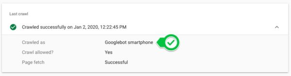
A smartphone version of Googlebot will crawl your mobile site and determine if its performance, content and user experience are up to scratch. If so, you get a better ranking. If it is lacking, other sites will rank higher and you could lose out. Even if you’re not focusing on mobile you will still be judged by your mobile site, so now’s the time to take action.
“The “Speed Update” applies the same standard to all pages, regardless of the technology used to build the page. The intent of the search query is still a very strong signal, so a slow page may still rank highly if it has great, relevant content.”
Check Search Console to see what Google used to crawl your pages
Things have changed
Right now, Google uses mobile-first indexing when evaluating new sites. Sites it knows about will still be evaluated on a per-site basis to see if they are fit for inclusion. To get Google to discover and understand it properly you must keep your mobile site crawlable by taking down all possible barriers such as poorly loading scripts and not blocking stuff in your robots.txt. It also has to load lightning fast if you want to be indexed well.
You can no longer present less information on your mobile site than on your desktop site. Your content has to be identical on both, because you will only rank based on the information on your mobile page. Don’t hide stuff! Michiel wrote a post about the so-called mobile parity. Or, like former Googler Maile Ohye told us in an interview:
“To “optimize” for the mobile-first index, make sure that what you serve to mobile users is the version of the content you’d want Google to index, not a pared down version, or a version that gets updated later than desktop, or a version that redirects to the mobile homepage.”
Maile Ohye
Don’t forget to tell Google your site is mobile-friendly. You can add a viewport declaration – if you’re using responsive design – or a Vary header when using dynamic serving. More on this later – or in Google’s developer documentation.
Mobile SEO is – just like regular SEO – all about making sure your site is crawlable and findable. Also, you need stellar performance, great content and a flawless UX. To get it right, you need to know how your site is currently performing and what your visitors are doing right now. For example, will people use the same keywords on mobile to find you? People often change how they search while using a mobile device. And what do you want people to do? Offering to navigate to the nearest Whole Foods is less than ideal when you’re on a desktop machine. It makes total sense on your smartphone, though.
Mobile SEO tools
You need to become best friends with Google Search Console. Its search tools are legendary and a big help if you want to find out how your site is doing in the search results. For instance, by using the Search Analytics feature, you can see how mobile and desktop users use words to find what they need. Are you targeting the right words? Should you focus on something else?
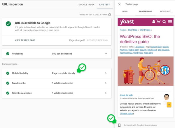
Googlebot needs to be able to crawl your JavaScript, CSS and image files to index it properly. There is a handy tool for this inside Search Console: URL Inspection. This tool lets you see exactly how Googlebot sees and renders your content. When the screen doesn’t align and the tool lists errors, you’ve got work to do.
Search Console lets you check how Google sees your mobile site
Mobile Usability tool
Another Google Search Console feature that makes your life easier is the Mobile Usability tool. This tool checks your site and presents an overview of posts and pages that don’t follow Google’s mobile-friendly rules. This is an excellent way to start improving your mobile SEO.
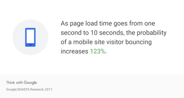
The number one thing you should be focusing on when you’re trying to improve mobile SEO is performance. Performance almost entirely boils down to site speed. It’s a no-brainer: the faster your site is, the happier your users will be. It’s well known that a site has to load within a couple of seconds or your visitors will give up and go elsewhere. If you combine this with the fact that sites are only getting bigger, it’s clear you have your work cut out.
Better get to work on that page load time
Optimizing performance, however, is a continuous process. Your site will never be fast enough because there’s always more you can improve – and that’s ok. By keeping a close watch on how your mobile site is performing, you can immediately jump onto every opportunity to improve it. Google loves fast sites, and so do your customers.
Responsive design vs. dynamic serving vs. separate domain
While developing your mobile site, you’ll have three options: responsive design, dynamic serving, or a separate site on a subdomain. Google prefers responsive design because you only have one site that adapts to the device it’s used on. There’s only one code base, so maintenance is easy. According to Google, using responsive design will make your site eligible for addition in the new mobile-first index. Always let Google know that your site is mobile-friendly by adding the meta name=“viewport” declaration in the head of your documents.
Dynamic serving takes a different approach. It uses server-side technology to serve a different version of your site to mobile users, depending on the way they access your site. The URL stays the same, but the files sent are completely different. You need to add the Vary header to get Google to crawl your site. This way, Google immediately knows that it will receive mobile-optimized files from somewhere else. A Vary header appears like this when a browser makes a request:
Vary: User-Agent
The third option is a separate mobile site on a different URL – usually an m. domain – and with different content. Google supports this method, but only if you make the correct connections between your regular desktop domain and the mobile domain. Use rel="alternate" and rel="canonical" to tell Google how these pages are connected. More on these different types and how Google uses them on this Developers page. Or you can read our rel=”canonical” ultimate guide.
Improve site speed of your mobile site
One of the most importants aspects of mobile SEO is improving site speed. PageSpeed Insights shows you exactly how fast your site loads on both mobile and desktop. It also suggests performance improving enhancements. Use this alongside the Developer Tools in browsers and the Speed Report in Search Console to see how your site is rendering its contents.
The two most important things PageSpeed Insights looks at:
FCP (first contentful paint): The first contentful paint happens when the first element of a requested page appears on the screen. This gives users the confirmation that the page is actually loading.
FID (first input delay): The first input delay is the time between the first interaction of a user with an element on the requested page and the reaction of the browser to that input. How quickly your page reacts to input is of utmost importance for it to appear fast and responsive.
Type in your URL and Insights will give you two scores: one for mobile and one for desktop. These will be different. If your score is red, you have much work to do. Orange means an average performance and green is good. It’ll give you suggestions on enhancing the performance of your site. Follow these suggestions, and you’ll be on the right track.
I hear you thinking:
“Nobody has a score of 0/100, right?”
Well, think again. A combination of factors can do your mobile site a lot of harm. Find a bad hosting provider, install WordPress on a crappy shared hosting platform, activate thirty plugins and upload a hundred non-optimized images to your blog and you are going to score badly. But these things can easily be fixed. Run PageSpeed Insights and other speed analyses tools and follow their advice.
When improving your page speed, you should always ask yourself if you need all these assets, libraries, images, plugins, theme features and so on. The famous saying “less is more” is still as valuable as ever.
The Google-led open source project AMP, or Accelerated Mobile Pages, has one goal: loading your pages as fast as possible. It’s been in development for some time now and making great strides. It is, however, a controversial technology, but since Google is pushing this so hard, it will be increasingly hard to do without it.
In the beginning, AMP was used on static posts, like blogs or news articles, that didn’t need interaction from the user. For e-commerce purposes and other dynamic types of pages, AMP fell short – until a year or so, that is. Today, AMP is capable of powering canonical sites, with more to come. Look into what AMP could do for your site and how you might implement it. Not every site needs it, but the ones that do could gain an awful lot from it.
PWAs offers another way of targeting mobile users. A progressive web app is an all-in-one solution that works on all devices, for all users. It’s the perfect crossover between the app world and the web world. The web app works like an app, without the need to publish it in an app store. PWAs combine the load speeds of mobile sites with the best functionality of a native app. When done correctly, a good PWA might fool users into thinking they are using a native app. Google has a must-read blog post if you want to know how to create indexable PWAs.
Thanks to technologies like service workers, the browser can do a lot more in the background, while keeping the front end updated in real-time. This makes it a good option if you need an app, but can’t justify the cost. There will be a lot happening with progressive web apps in the next couple of years. Every major browser — both mobile and desktop — now supports service workers, even Apple’s Safari on MacOS and iOS. There are, however, still some kinks to be ironed out before Apple’s implementation is solid.
Focus on user experience
Besides being easily found and lightning fast, your mobile site should offer an enjoyable user experience. Find out which common tasks your customers have on your site. What is their search intent? Try to remove any obstacles and make sure users can achieve their goals quickly. There’s a lot you need to consider when optimizing user experience. Here are a couple of things you need to think about:
First and foremost: don’t forget your customer!
Make your site mobile site useful and enjoyable
Fix your font size: your typography needs to be top notch.
Keep enough room between the clickable elements.
Make your sub-menu clickable, so users don’t automatically go back to home instead of the submenu.
Put your phone number on the homepage and make it clickable. This way, people can call you if they want to do business.
Don’t make users pinch and zoom to see – and use – your interface.
While we use our smartphones a lot in our homes, these devices become even more useful when we’re out and about. Google found that 76% of people who searched for something nearby visited a related business within a day. 28% of those visits led to a sale.
To cope with that local demand, or so-called near me searches, you need to work on your local SEO. Local search results can look very different from regular desktop searches, so you have to know what to target and how to target it. Here are some ways you can improve your local SEO for mobile:
Google My Business: Sign up and fill in your details. Here, you can keep your NAP data up to date, respond to reviews and upload photos, among other things.
Reviews: Ask your customers for reviews, mark them up with structured data and present them on a particular page on your site. This does wonders.
Photos: Take beautiful pictures of your business and add them to Google My Business.
Smartphone screens are small. On that screen, text gets truncated and wrapped in a seemingly never-ending stream of paragraphs. Users have to scroll endlessly. Text on a mobile screen has the potential to give any web designer a headache. But the design – and use – of text is of crucial importance to the success of your site. If your site is unreadable or just plain ugly, people will not read your 1,000-word article. Hell, maybe not even your 100-word summary. Fix your typography.
People read a lot on their smartphones, but you have to make it as easy as possible for them to do so. You also need to make sure that your content is up to scratch.
Always keep the restrictions of the small screen in mind when creating or editing content. Don’t use too many long sentences, keep your paragraphs to around four sentences and break up text using bullet points, lists and headings. Nothing is more daunting to your visitor than a massive block of unformatted text. Check your content on a smartphone to see how it looks and find ways to improve it.
Google shows less information in the search results on mobile than on a desktop. Your meta descriptions and your titles will be truncated if you make them too long. Think about that when you optimize your posts and pages. You lose several characters when optimizing your meta descriptions and titles for mobile. In Yoast SEO’s snippet editor, you can switch between a mobile and desktop preview. This way, you can compare the differences between the two and find the perfect middle ground.
When working on your content, you should account for the next big thing: voice search. Yes, it’s been around for a while, but with the advent of Apple’s Siri, Amazon’s Alexa and Google’s Home assistant, things are moving fast. More and more people are using their voice to perform actions on the web, and your content has to provide the answers. If done correctly, you might kill two birds with one stone: you’ll not only respond to questions mobile users have, but it might also lead to so-called featured snippets or answer boxes on desktop searches. Getting a featured snippet almost guarantees your content to be a top answer for assistants. Curious what’s powering conversational search?
To prepare for voice search, you need to take a good look at your current content. Ask yourself, does it answer any question a user might have? If not, change it. Find out which questions people use to find your content and optimize for that. Use Google’s autofill or tools like Answer the Public to find ideas for questions to answer.
Structured data is hot. By adding structured data in the form of Schema.org to your site, you can open a line of communication with search engines. Structured data makes it clear to search engines what all the different elements on your site mean. If done correctly, search engines can use this data to give you highlighted search results, known as rich results or rich snippets. This way, your site immediately stands out from the crowd, which could lead to a higher click-through rate.
Structured data allows for many new ways of presenting search results. The rich results we used to know as rich cards, for instance, uses data you can add to your mobile site. The result is a snippet that is mobile-optimized and very attractive to click. Since Google heavily investing in improving and expanding the types of rich results these might turn out to be your ticket to enhanced visibility. Try to get those featured snippets!
Structured data is one of the most important topics to get your head around. See our structured data course for an easy way to learn how to add structured data to your mobile site.
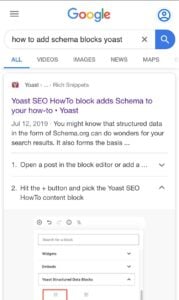
Yoast SEO takes care of your Schema needs
A mobile how-to rich result
Adding Schema to your site has always been a struggle — but not any more! Yoast SEO is making it easy for you. The popular SEO plugin automatically adds an extensive list of Schema structured data properties to your site. Not only that, Yoast SEO also ties everything together in a neat graph. This graph makes it incredibly easy for a search engine to understand the true meaning of your site. That’s not all, because the free Yoast SEO structured data content blocks turn the WordPress block editor into a helpful tool to craft FAQ pages and how-to articles — with more block types to come. Both of these Schema types have a relatively easy to get rich result on mobile attached to it as well.
This ultimate guide to mobile SEO gives you a lot of pointers to improve the performance of your mobile site. Mobile SEO should always be a work in progress because there are always new developments, but also technologies arrive and are superseded. The world is always changing, and you need to keep up. If you do, the rewards can be great.
So, what are you waiting for? Get your smartphone, check your site on a mobile browser and find and fix those issues. Use this mobile SEO guide well, because this is an important time! This is the time to take action because if you don’t, you might get left behind.
Favicons are those little icons you see in your browser tabs. When you have lots of open tabs in your browser it helps you recognize and find the page you were looking for. They are important for your branding, even more so, because Google recently decided to add them to the mobile search results. So, let’s take a closer look at those little icons and your branding here!
What is a favicon?
Not too long ago, you would only see those little icons, called favicons, in your browser tabs:
Which would help you find the tab you need when you had many open tabs in your browser. But, for some time now, Google shows them in their mobile search results too:
Did you know that, as of Yoast SEO 12.1, you’re able to see your site’s favicon in Yoast SEO’s mobile snippet preview too?
If your favicon represents a trustworthy brand, it can help people recognize your brand through this little icon, thereby boosting the click-through rate to your site. After all, a picture says more than a thousand words!
Make it stand out
You should make sure your favicon stands out, whether it’s from that long list of tabs or the search results. Check if it matches your logo and website well. Especially, when you are not one of the big brands, you want people to recognize this little icon. Two tips directly related to that are:
Avoid too many details in your favicon;
Please use the right colors, so the favicon doesn’t blend in with the gray of your browser tab.
Both are closely related to branding. Your brand should be recognizable in your favicon. Proper branding is making sure people will relate your favicon to your website immediately.
As to which format and size to use for your favicon you best stick to Google’s guidelines. This is what they recommend:
Your favicon should be a multiple of 48px square, for example: 48x48px, 96x96px, 144x144px and so on. SVG files, of course, do not have a specific size. Any valid favicon format is supported. Google will rescale your image to 16x16px for use in search results, so make sure that it looks good at that resolution. Note: do not provide a 16x16px favicon.
An SEO benefit?
Are there real SEO benefits to favicons? Well, the advantage of these icons certainly became bigger now they’re present in the mobile search results. While adding a favicon won’t make your page rank higher directly, it might increase the click-through rate to your page, when it is shown next to your URL in the search results. But, beware: this only works if your favicon is associated with a positive feeling regarding your brand or website. In practice, this means you should invest time in holistic SEO: making your website (and product/service) awesome in every way!
Favicons in WordPress
If you use WordPress, you might already know that there’s been a favicon functionality in WordPress core ever since version 4.3. So you can use this default functionality, without hassle. It’s located in the Customizer and is called Site Icon. Here, you can read how to change your site’s favicon in WordPress, step by step.
Final note: when you upload your icon, don’t forget to optimize the image, so it won’t slow down your site :)
In our Ask Yoast case studies we give SEO advice for websites in a specific market or industry. This time: the website of Slemish Design Studio Architects, the business site of an architect duo. The architects told us that they get great responses from their clients, but is their website optimized for search engines as well? We’ll dive into this architectural website to see what improvements can be made to enhance their site’s SEO.
First impression
The first page we land on is the homepage. We see lots of full screen images of the great work these architects deliver on top of the homepage. Though impressive, the images are shown in a slider. Loyal readers of our blog know that we’re not a big fan of sliders. Many experiments show why you shouldn’t use a slider on your website. Only 1% of your visitors will actually click on a slider, they slow down your website and lots of visitors ignore sliders because of banner blindness. Just to name a few.
Looking at this specific website, the slider images are very big as well. The textual content of the homepage is pushed down. We recommend showing some smaller images on top of the site, instead of the slider, and adding some clear introductory content just below these images. Try adding your USPs to the introductory content: Why should visitors choose you as their architect?
Lastly, by adding a clear call-to-action just below the introductory content you’ll make sure visitors can easily navigate to your most important pages. For example, you could think of a button which says ‘Get inspired by our projects’ or ‘Our services’: decide what the main goal of your homepage is. Just to show you the difference, we’ve created a mock-up of how the homepage could look like after following our advice:
Beautiful images, too little text
On the ‘The Studio’ page, we notice a tab ‘What we do’. This tabbed content tells visitors what kind of work you do and what type of services you offer. Because of the relevancy of this content, we think these services deserve their own menu item. Visitors who want to know more about your team and your company may click on ‘The Studio’. However, they might not expect to find the services you offer there.
In addition to that, your services are great subjects to write about. Writing nice informational copy about your services will increase your chance of ranking for keywords related to these services. When you add sufficient relevant content, Google will understand that your website has content for people looking for services like yours.This means those people will easily find you. The more your content seems to fit to the needs of people who search for these keywords, the higher you’ll rank in the future.
Make sure you optimize one specific page or post for one subject/keyword. When you optimize one page for more keywords that are too different, it’s unclear for Google what the main subject of the page is. Pages that contain a lot of information about the keywords you really want to rank for, should become your cornerstone content pages. This blog post about cornerstone content explains in detail what cornerstone content means and this blogpost shows you how to incorporate cornerstone content into your website.
Lastly, we think you can improve your content as well by adding more copy to your project pages. Consider writing a nice text about the planning stage of the project, the building stage and the delivery stage of the project, for instance. In this copy you can add relevant keywords for your business. In addition to that, this allows you to internally link to your cornerstone content pages from your project pages.
When you decide to write more copy for your website in the future, make sure the pages and posts have a great heading structure. On your current pages and posts, we noticed that your logo is an H1 heading. However, the H1 heading should describe the main subject of a particular page on your site to help Google understand what the subject of that specific page or post is.
For example, checking ‘The studio’ page, we see the following headings on top of the page:
Your company name/logo has an H1 tag now, which means that your company name would be the main subject of this page. While in fact, ‘The studio’ is the main subject of the page. So you should change the H2 heading of ‘The studio’ into an H1 heading. Just remove the H1 heading from the logo on every page of the website. We’d advise to check all of your pages and posts and only add one H1 heading, that describes what can be found on there, on each page.
You’ll need to add relevant keywords to your page titles to help Google understand what your pages are about. Since page titles are still one of the most important ranking factors it’s important to optimize those to the fullest.
Looking at the page title of your homepage, we think you’ve added too many different keywords to show what your website is about:
Adding all different locations to your page title makes it unclear what your website is about. Moreover, the snippet doesn’t look very enticing to click on in the search results. This might cause a low CTR, or click-through rate. If you want to rank for all the different locations, adding separate pages with unique page titles and content for every location would be a better idea.
We’d advise to create appealing page titles and make sure they describe what can be found on that specific URL. For the homepage, use your USP and add a call-to-action such as ‘See our projects here’ to make people click on your page in the search results. Don’t you think a snippet like this will be more appealing to potential visitors?
On top of that, it’s important to be consistent in your branding. Add your company name to every page title. If you do that, people will recognize your page in the search results more easily, because of the brand name in every page title.
Add more relevant content to your blog
Having a blog can be very beneficial for SEO. Adding posts regularly makes it easy to add content about relevant keywords to your website. It helps you to start ranking for new keywords and to keep ranking for the keywords you already rank for.
Slemish Design Studio Architects have a blog and they add new posts regularly, which is great. However, it seems that lots of posts have little textual content. For example, this post only has two sentences:
Google could consider this post as a thin content page, which could hurt your website’s rankings. Since pages like these don’t add much value to your website, you’d better add more content or remove them from your website.
Besides the benefits of adding more content about relevant keywords to a blog, a blog also gives you an opportunity to add more internal links to your most important pages and posts. For example, when you’ve created a separate page for the service ‘Sun Rooms’ you could write a blog post about new innovations for sun rooms. From that post you can add an internal link to the page about the ‘Sun Rooms’ service. Doing this consistently, that service page – which could be a great cornerstone content page if you add sufficient content – will become a better search result, according to Google.
In addition to internal links within a text, you can add a popular, recent or related posts section to the blog. The sidebar is often used to add sections like these. These links in the sidebar will give the posts they link to some extra link value.
Lastly, adding your blog’s categories to the sidebar will give your category pages some more link value too. Consider doing this if you want to rank with your category pages.
A fast loading website
The longer visitors have to wait for your website to load completely, the more likely it gets that some of them will ‘bounce’ back to the search results. A long loading time frustrates visitors, so they might leave your website before seeing any relevant content. Google uses bounce rate, among other things, to determine if a website provides visitors with a good result. When lots of visitors bounce back to Google’s search results quickly, that isn’t a good sign. You might understand that this can harm your rankings.
On top of that, page speed is an actual ranking factor. Google understands that a website with bad loading times probably isn’t the best result. Similar websites that load faster are likely to end up higher in the search results.
We’ve tested the website of Slemish Design Studio Architects and we found a score of 24/100. The score is in red and this means that there’s work to do! Just follow the advice Google gives in the page speed tool as this leads to both a better user experience, as well as better rankings.
It was a pleasure analyzing the website of this architect duo. You show some amazing work in the images on the website! Adding a cleaner homepage with a clear call-to-action could result in more conversions, so more actual clients. Also, specific pages for all your services could be valuable for both Google and visitors.
Basically, our most important SEO advice is: make sure Google understands what your website is about. This means you’ll need to write relevant content about keywords you’d like to rank for. Furthermore, optimizing your site’s metadata – like titles and meta descriptions – and headings would be beneficial. With internal links you can connect your content and give your most important pages extra value.
And last, but definitely not least, making your website load faster will really improve your site’s SEO and user experience!
Breadcrumbs are an important part of almost every good website. These little navigational aids don’t just tell people where they are on your site, but they also help Google work out how your site is structured. That’s why it makes a lot of sense to add these helpful little pointers. Let’s take a look at how breadcrumb navigation works.
What are breadcrumbs?
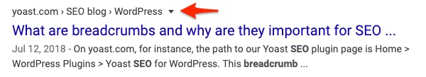
A breadcrumb is a small text path, often located at the top of a page indicating where the user is on the site. On yoast.com, for instance, the path to our Yoast SEO plugin page is Home > WordPress Plugins > Yoast SEO for WordPress. This breadcrumb trail immediately shows you where you are. Every step of that path is clickable, all the way back to the homepage.
But why is this navigational help called a breadcrumb? When Hansel and Gretel went into the woods, Hansel dropped pieces of bread onto the ground so they could find their way home if they got lost. These breadcrumbs eventually became the model for the breadcrumbs we see on websites these days.
You can see the breadcrumb clearly in Google
Breadcrumbs also appear in Google search results, and you can take advantage of this if you use Yoast SEO or add the correct form of structured data to your site. Breadcrumbs in search results give users an easy-to-understand overview of where the page sits on your site. Yoast SEO automatically adds the necessary structured data — a BreadcrumbList — in JSON-LD format for you. Just flip the switch in the settings and you’ll see the relevant lines appear in your source code — although, sometimes, you need to add a small piece of code to your theme as well. Find out more on our breadcrumb structured data in our documentation.
Different types of breadcrumbs
You may have noticed that there are different types of breadcrumbs. These are the three most common ones:
Hierarchy-based breadcrumbs
These are the most common and it’s how we use breadcrumbs on our site. Breadcrumbs like this tell you where you are in a site structure and how many steps there are to get back to the homepage. Something like Home > Blog > Category > Post name.
Attribute-based breadcrumbs
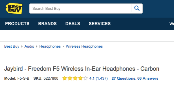
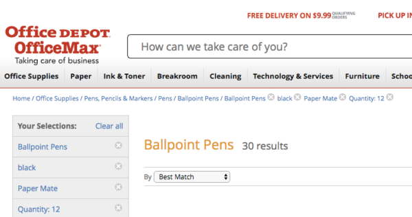
Attribute-based breadcrumbs are seen most commonly when a user has searched on an e-commerce site, and the breadcrumb trail is made up of product attributes – for example: Home > Product category > Gender > Size > Color.
History-based breadcrumbs
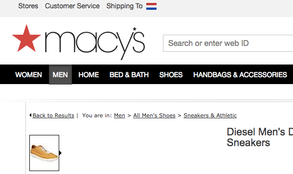
History-based breadcrumbs do exactly what it says on the tin; they are ordered according to what you have been doing on the site. Think of these as an alternative to your internet history bar, so you get something like this: Home > Previous page > Previous page > Previous page > Current page. It’s also possible to combine these like Macy’s does in the screenshot below.
Advantages of using breadcrumbs
There are several advantages to using breadcrumbs on your site. Let’s take a quick look at them:
1. Google loves them
Your visitors like breadcrumbs, but Google does too. Breadcrumbs give Google another way of figuring out how your website is structured, but, as covered earlier, Google may also use your breadcrumbs in the actual search results, which makes your result much more enticing to users. To increase the chances of your breadcrumbs appearing in Google, you need to add structured data like Yoast SEO does.
2. They enhance the user experience
People hate being lost. When confronted with a new location, people often look around in search of recognizable objects or landmarks – and the same is true of websites. You need to keep visitors happy and reduce friction as much as possible. Breadcrumbs can help your user experience since they are a common interface element that instantly shows people a way out. There’s no need to click the back button!
3. They lower bounce rates
Hardly anyone enters a site via the homepage — It’s all about organic search. That means any part of your site could be an entry point. You need to come up with a way to guide these visitors to other parts of your site if the selected page doesn’t meet their needs. Breadcrumbs can lower bounce rates because you’re offering visitors an alternative way to browse your site. Don’t you think it’s better to send a visitor to your homepage than back to Google?
How to add breadcrumbs
There are several ways of adding breadcrumbs to your site. Firstly, if you use WordPress, you can use one of the many breadcrumb plugins or – of course – Yoast SEO. If you use a different CMS the process will be different. It is also possible to add them to your code by hand. If you also want them to appear in Google results, you need to use structured data in a way that Google understands. You can find more information on this in Google’s developer documentation on breadcrumbs.
Yoast SEO offers an easy way to add breadcrumbs to your WordPress site. It will add everything necessary not just to add them to your site, but to get them ready for Google. To add breadcrumbs to your site, you need to add the following piece of code to your theme where you want them to appear:
This code can often be placed inside the single.php or page.php files, just above the title of the page. Some themes want it at the end of the header.php file. It’s not a good idea to add it to functions.php since this could cause problems.
After adding the code, you can go to the advanced settings of Yoast SEO and switch on breadcrumb support. You can also control how the breadcrumb structure will look and what prefixes will be used. Find out more on our document on implementing breadcrumbs with Yoast SEO.
You can find the settings for breadcrumbs in SEO > Search Appearance > Breadcrumbs
Conclusion
Despite using breadcrumbs, Hansel and Gretel still got lost in the woods. Don’t let that happen to your visitors! Breadcrumbs provide an easy-to-grasp way for visitors to navigate your site and they instantly understand how your site structure works. Google loves them for the same reason. So use Yoast SEO to easily add breadcrumbs to your site.